
How to create a reusable TextInput in React Native with Typescript
I learned these principles from my former lead dev


In this article, I will discuss and demonstrate the principles I use for creating and reusing components in React Native. Today’s lesson will be on the TextInput component.
Adding correct typing
Since we’re using Typescript, let’s import the proper typing for our TextInput component with the TextInputProps given to us by react-native.

The purpose of TextInputProps is to protect the developer from making unintended mistakes when using or passing props to the TextInput component. For example, let’s say I accidentally typed onBlurr instead of onBlur. I would receive an error message from typescript because onBlurr isn’t a prop used on the TextInput component.
onBlur is called when a text input is out of focus. Click here to learn more!
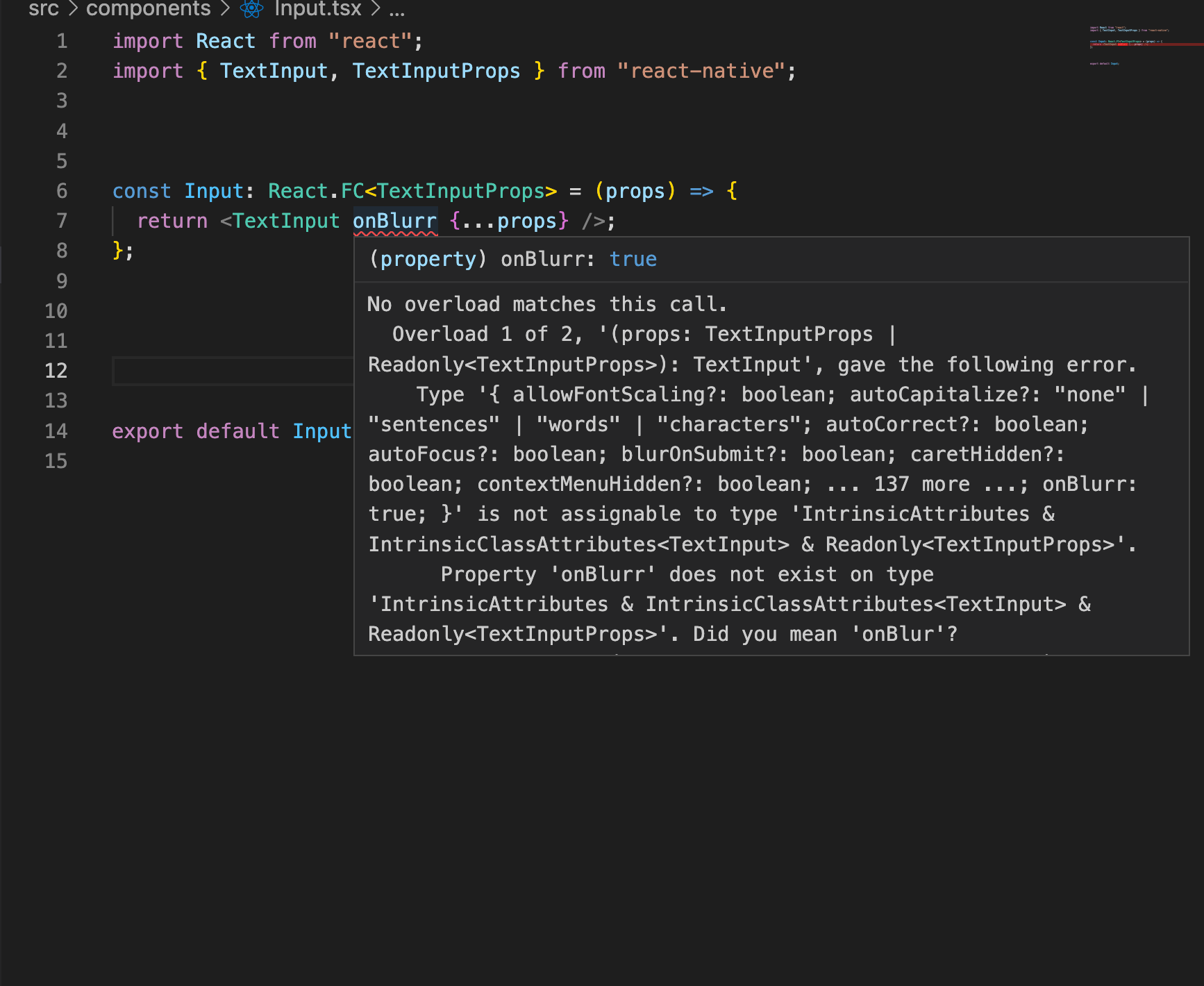
The example above captures the power of using Typescript with React Native. When you type components, you give yourself and other developers who may interact with your code, safe measures against mistakes and other unintended decisions.
Constant and variable props
Let’s continue building out our re-usable component with what I call constant and variable props. For example, a prop that contains a placeholder value would be considered a variable prop since the placeholder name will likely be different for each input (i.e, first name and last name). A constant variable would be something like the placeholderTextColor which is ALWAYS black in our mock design below 👇🏾.
When building components in React, I like to consider what props are constants and what props are variables based on the design. Let’s look at a pretend story book design to understand this concept better.

If you notice the design above, you should recognize constants and variables.
constants - styling (border, border radius, and height), placeholder, placeholderTextColor
variables - returnTypeKey, blurOnSubmit,…
If you’re not familiar with returnTypeKey or blurOnSubmit click here!
I like to follow these guide lines when creating re-usable components:
If it’s a constant - I will build it into the component and allow a prop to modify for “future flexibility”
If its a variable - I will rely on the spread operator to account for the different possibilities
If its a mix with minor exceptions - I will pre-build it into the component and use some conditional logic (or logical operator) to account for the exceptions
Here’s a working example to understand the concepts of constants and variables better.

Lets dissect this code:
{…props} - (variable) - By spreading my props, I’m keeping my TextInput from becoming excessively bloated by trying to account for EVERY scenario. When you know there will be variable props like placeholder or keyBoardType, I encourage you to spread your props.
placeholderTextColor -(constant) - Because our storybook design had a constant placeholder text of black, it made sense for me to “pre-build” this in the component. By pre configuring my component with this prop value, I avoid repeating myself every time I reuse this component
blurOnSubmit- (mix) - It is common to set this prop to false until you reach the last input. This is what I meant in my guidelines when I said,”…if it’s a mix with minor exceptions.” The minor exception in this case is the last input which will set blurOnSubmit to true. Because of this, I decided to use the Double bang operator (will return false when blurOnSubmit is undefined and true when added to the last input) to account for this exception. By doing this, I will only have to add blurOnSubmit on the last input instead of all of them
returnKeyType - (mix)- This configuration assumes a design that always has a returnKeyType of “next” until the last input. If this were the case, it makes sense to add a logical operator to account for one or two exceptions then hardcode the returnKeyType prop every time you reused this component.
style - (constant) - Because the style was constant in our fake story book, I decided to use it as a base style with the option to override if necessary. If I noticed I was constantly overriding this style prop, I would highly consider making a new TextInput component.
Now for an example of what implementing our newly designed TextInput component would like.

I hope you gained value from this article. If you did hit that subscribe button below 👇🏾